Taylor Lowrimore Logo Design, Website and Branding by Hello Gypsy
TAYLOR LOWRIMORE
LOGO DESIGN, BRAND IDENTITY, SQUARESPACE WEBSITE
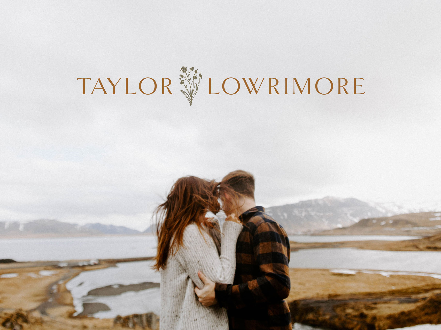
The goal for this project was to design an inspired, honest, and authentic looking logo + brand identity for Taylor Lowrimore. The brand was to feel simple and natural, inspired by meaningful connection, and evoke a sense of adventure among couples looking to hire a photographer for their intimate wedding or elopement.
Taylor Lowrimore Logo Design, Website and Branding by Hello Gypsy
Taylor Lowrimore Logo Design, Website and Branding by Hello Gypsy
Taylor Lowrimore Logo Design, Website and Branding by Hello Gypsy
Taylor Lowrimore Logo Design, Website and Branding by Hello Gypsy
Taylor Lowrimore Logo Design, Website and Branding by Hello Gypsy
Taylor Lowrimore is an adventurous elopement and intimate wedding photographer. She provides stunning, emotional, and honest photographs to couples who are eccentric and true to themselves. Taylor works with less traditional couples that choose to "go against the grain" and have more unique and personal weddings — true to their story as a couple. She delivers timeless finished products to her clients, including heirloom quality prints, albums, and canvas-wrapped prints.
Taylor Lowrimore Logo Design, Website and Branding by Hello Gypsy
Taylor Lowrimore Logo Design, Website and Branding by Hello Gypsy
Taylor lives in pursuit of the unknown and unexpected. In work and in life, she loves connecting with couples who embrace spontaneity and new frontiers. She also puts her heart and soul into every photograph she takes and thinks stories and moments should be sacred and cherished.
Because of this, we wanted the brand concept to be simple and rooted in nature, with the perfect combination of minimal design and artistic and illustrative details. This brand design is natural, welcoming and adventurous looking in order to reach our ideal target market. We achieved this look by using darker, bold neutrals like burnt clay, forest and olive greens, as well as lighter, more airy neutrals like dusk blue and sand. By combining both warm and cool tones, the brand design is well rounded in contrast — nothing too masculine or feminine — and appealing to both men and women looking to choose the right photographer for their wedding or elopement.
Taylor Lowrimore Logo Design, Website and Branding by Hello Gypsy
Taylor Lowrimore Logo Design, Website and Branding by Hello Gypsy
Taylor Lowrimore Logo Design, Website and Branding by Hello Gypsy
Taylor Lowrimore Logo Design, Website and Branding by Hello Gypsy
Taylor Lowrimore Logo Design, Website and Branding by Hello Gypsy
Taylor Lowrimore Logo Design, Website and Branding by Hello Gypsy
Taylor Lowrimore Logo Design, Website and Branding by Hello Gypsy
To see the full website, please visit taylorlowrimore.com.
And follow Taylor's adventures on instagram.
View More Work


