Jacque Kent Logo and Branding by Hello Gypsy
JACQUE KENT INTERIOR DESIGN
Logo design, brand Identity, SquareSpace WEbsite
Jacque Kent is an interior designer with amazing style in Chicago. She's worked on residential and commercial projects all over the country, but after leaving the agency world, she now has her own business and focuses on redesigning clients' homes. Most of her projects are in Chicago neighborhoods, but she also has clients in Miami, Palm Springs and Rancho Mirage.
Jacque Kent Logo and Branding by Hello Gypsy
Jacque Kent Logo and Branding by Hello Gypsy
Jacque Kent Logo and Branding by Hello Gypsy
Jacque Kent Logo and Branding by Hello Gypsy
Jacque Kent Logo and Branding by Hello Gypsy
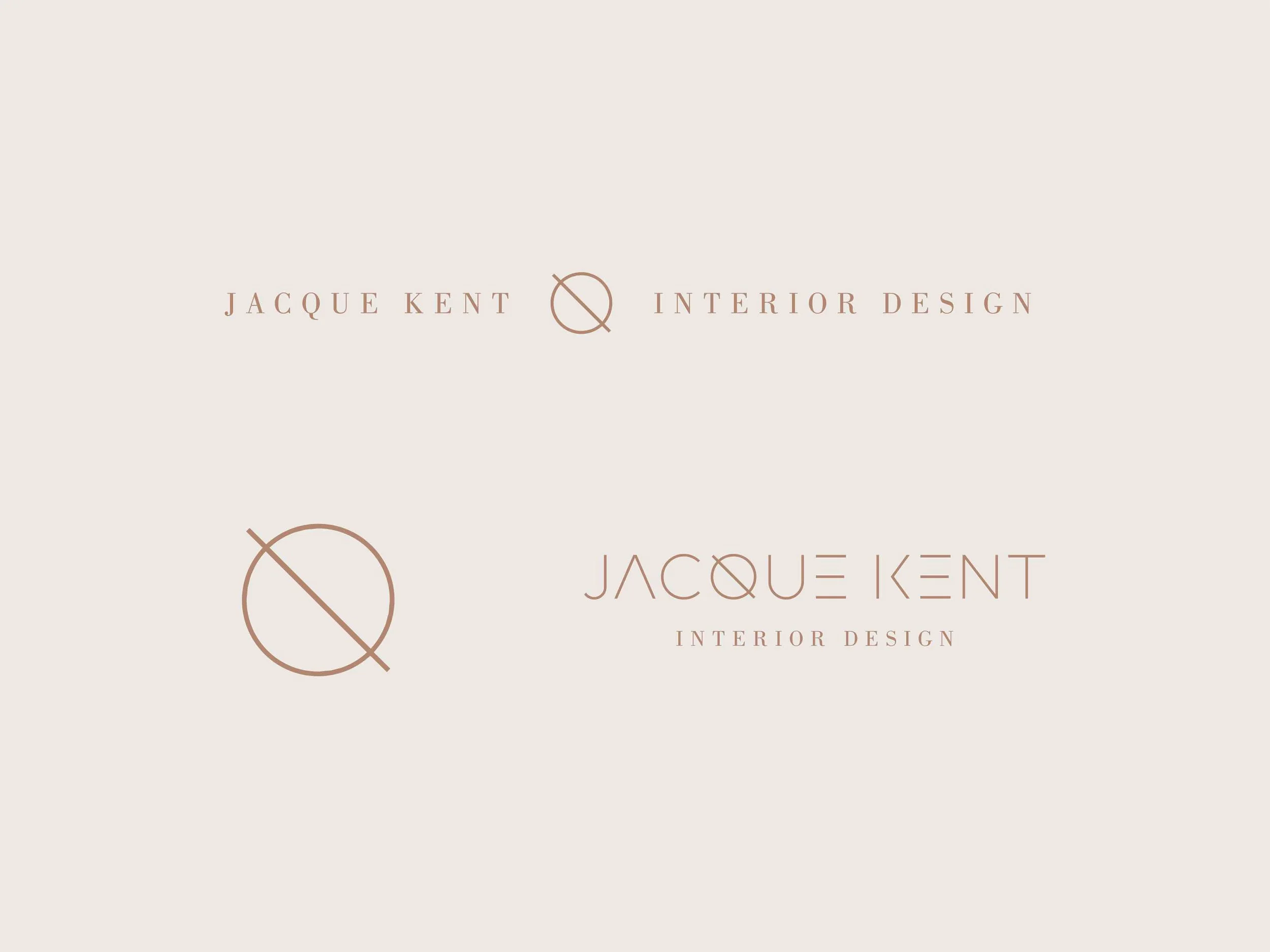
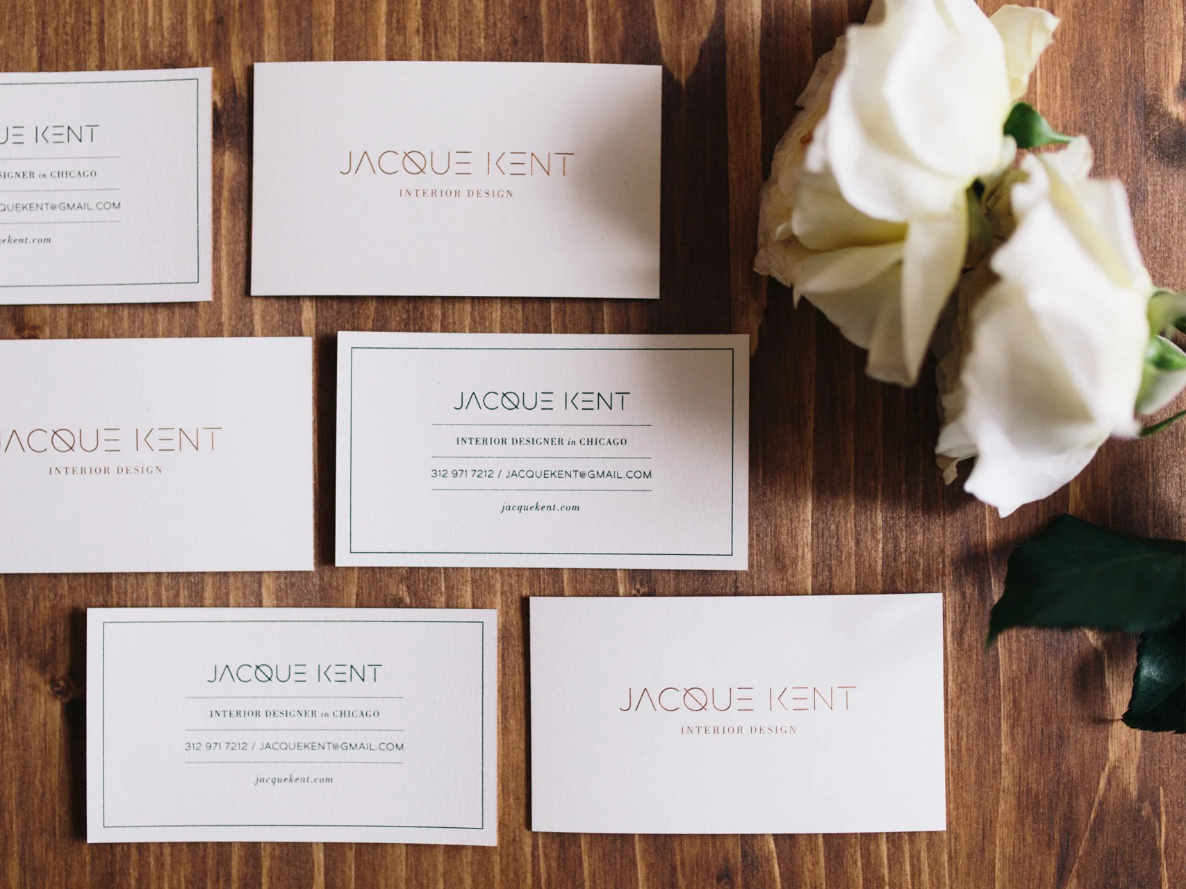
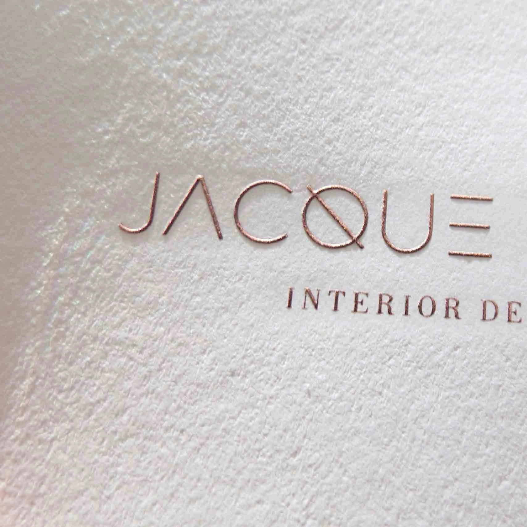
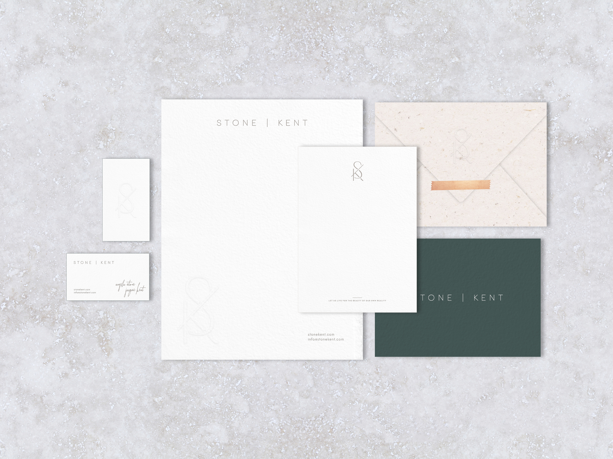
The focus for this brand identity began with Jacque’s name. For the logo, we chose to highlight the letter "Q" since it's a unique letter and makes her name different. From there, the Q inspired ideas of contrast and balance since the letter physically has a hard line drawn through a soft shape.
The idea of juxtaposing opposite design elements guided the brand visuals. The branding mixes serif + sans serif typography, warm + cool neutral colors, masculine + feminine details, and soft + hard textures.
Jacque Kent Logo and Branding by Hello Gypsy
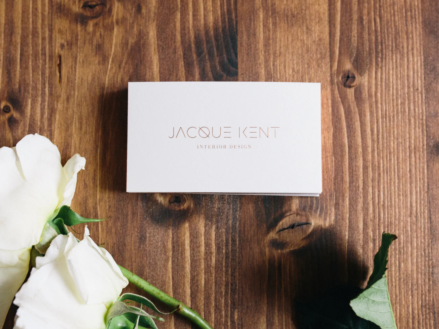
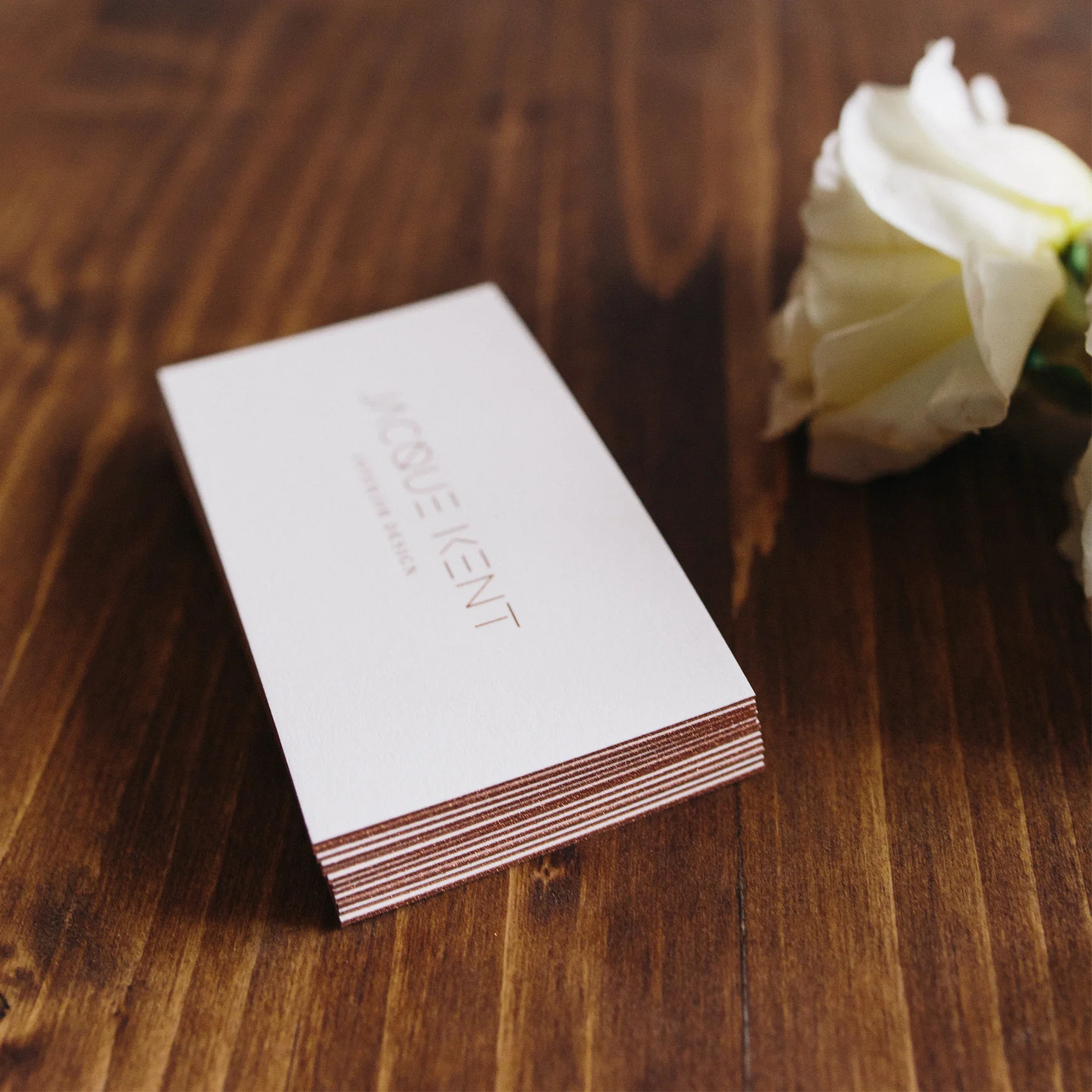
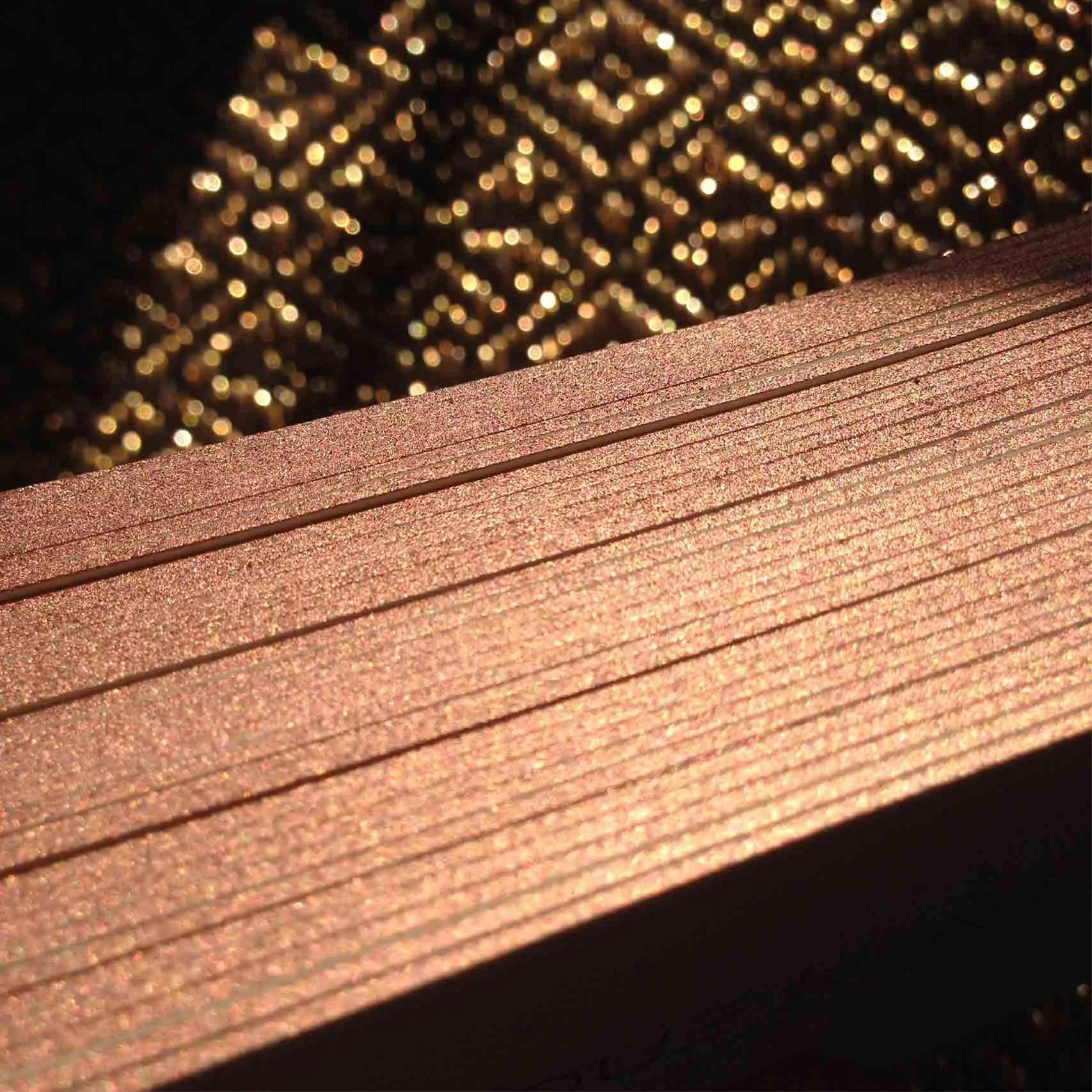
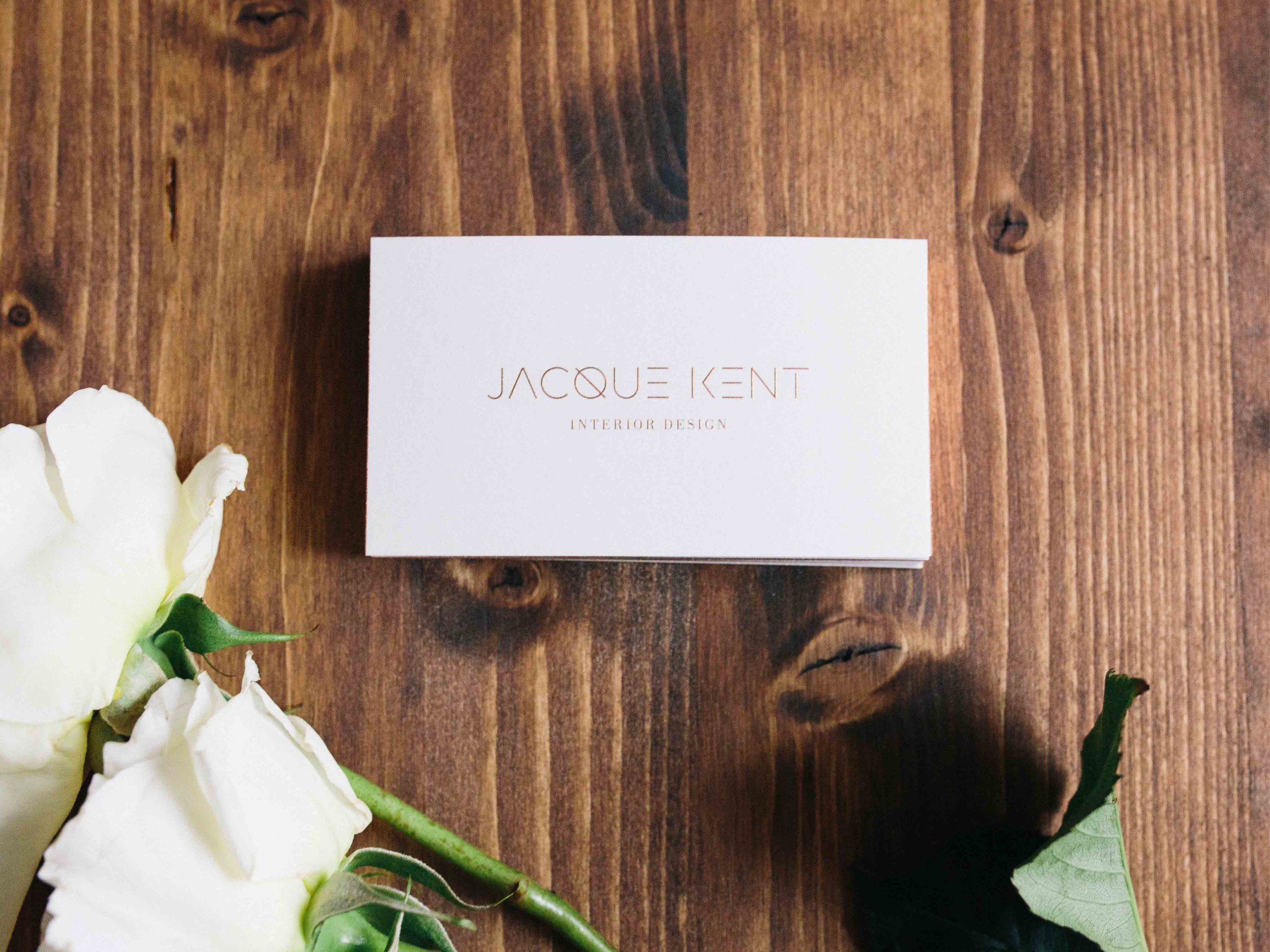
The business cards use a textured, warm white cotton duplexed paper with engraved rose gold logo on the front + matching rose gold edge coloring. The backside has both serif and sans serif, raised print, black typography.
Jacque Kent Logo and Branding by Hello Gypsy
Jacque Kent Logo and Branding by Hello Gypsy
Jacque Kent Logo and Branding by Hello Gypsy
Jacque Kent Logo and Branding by Hello Gypsy
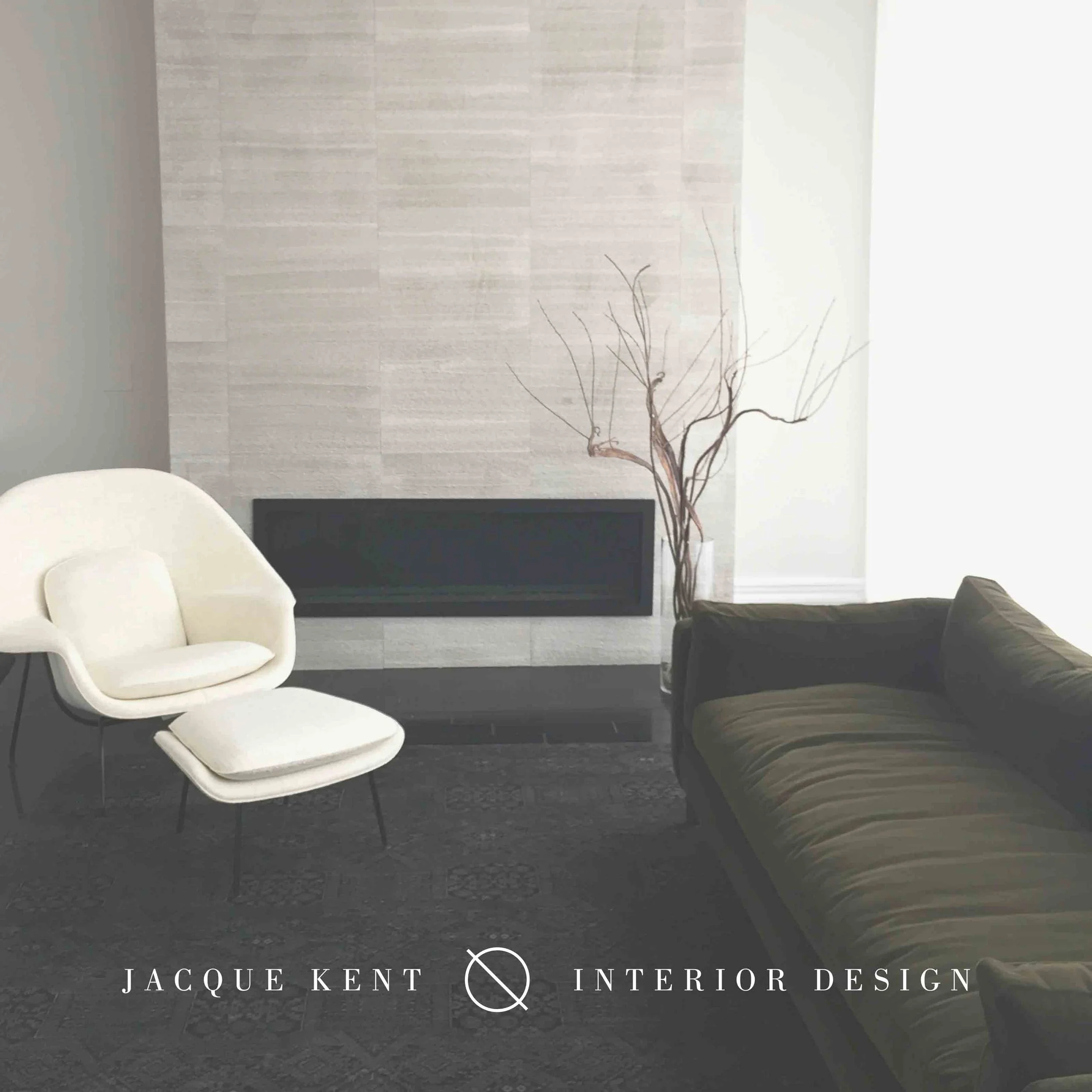
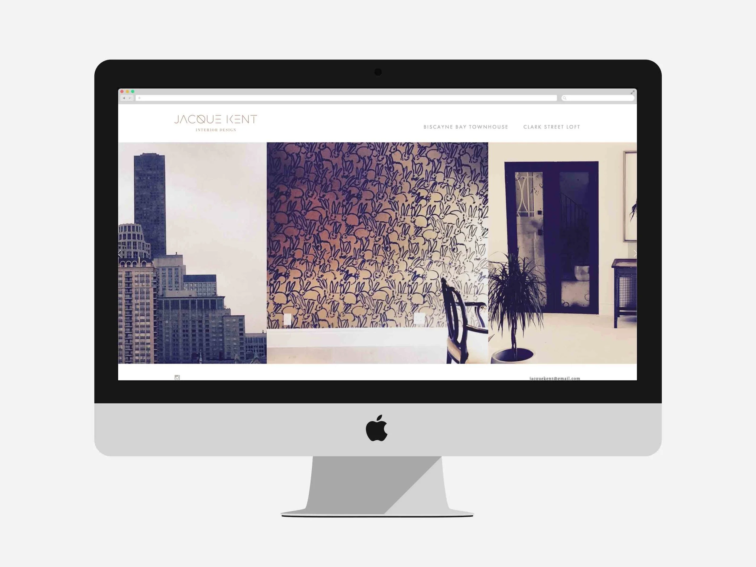
The website layouts are kept simple and geometric to highlight the photography as well as showcase Jacque's style. For this photo shoot, we traveled to Miami to shoot an amazing townhouse Jacque designed. We made sure to get a mix of overview shots to really show off the space as well as detail photos that make her design pop.
Jacque Kent Logo and Branding by Hello Gypsy
To see the full website, please visit jacquekent.com.
View More Work

