Stone | Kent Logo Design and Branding by Hello Gypsy
STONE | KENT
LOGO DESIGN, BRAND IDENTITY, Print Collateral, SQUARESPACE WEBSITE
Stone | Kent is an interior design firm that creates spaces that are natural and sculptural, layered in texture and story. Their design aesthetic juxtaposes feminine and masculine elements to create a feeling of balance. They are inspired by the hunt for one of a kind pieces from around the world, while also working with local artisans. The firm is based in Chicago with clientele from New York to Miami to Southern California.
Stone | Kent Logo Design and Branding by Hello Gypsy
Stone | Kent Logo Design and Branding by Hello Gypsy
Stone | Kent Logo Design and Branding by Hello Gypsy
Stone | Kent Logo Design and Branding by Hello Gypsy
Stone | Kent Logo Design and Branding by Hello Gypsy
Stone | Kent was founded by two independent and established designers, Angela Stone and Jacque Kent. Their partnership began when these friends decided to merge forces to create more balance in their lives, allowing for inspiration and artistry to be the focus of their work.
The goal for our project together was to design an understated, elegant, and artistic looking logo and brand identity. The design was to be inspired by nature and tailored to feel modern, peaceful, and a bit mysterious in order to attract new clients who were looking to update the feeling of their home.
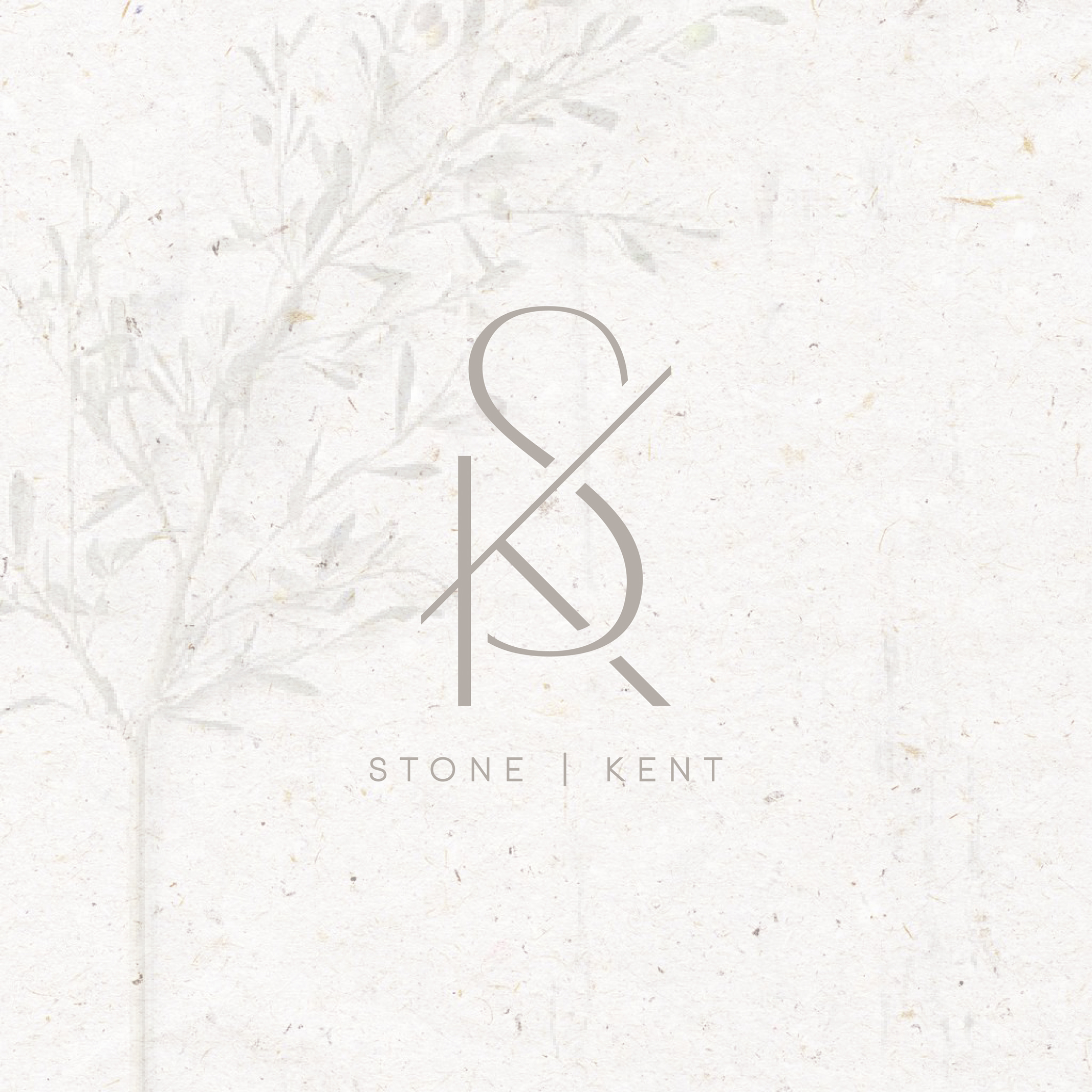
For their logo, Angela and Jacque asked Hello Gypsy to incorporate the initials from their last names into a simple and poetic monogram, while keeping the Stone | Kent wordmark as simple as possible.
Stone | Kent Logo Design and Branding by Hello Gypsy
Stone | Kent Logo Design and Branding by Hello Gypsy
Stone | Kent Logo Design and Branding by Hello Gypsy
This brand concept is based on the idea of understated, but impactful, artistic, and minimal contrast. It combines warmth, cool tones, and texture in order to balance ideas of feminine vs. masculine, full vs. empty, and subtle vs. dramatic. The design also uses olive branch imagery to add a natural touch, as well as symbolize the peaceful and beautiful way Stone | Kent designs interiors.
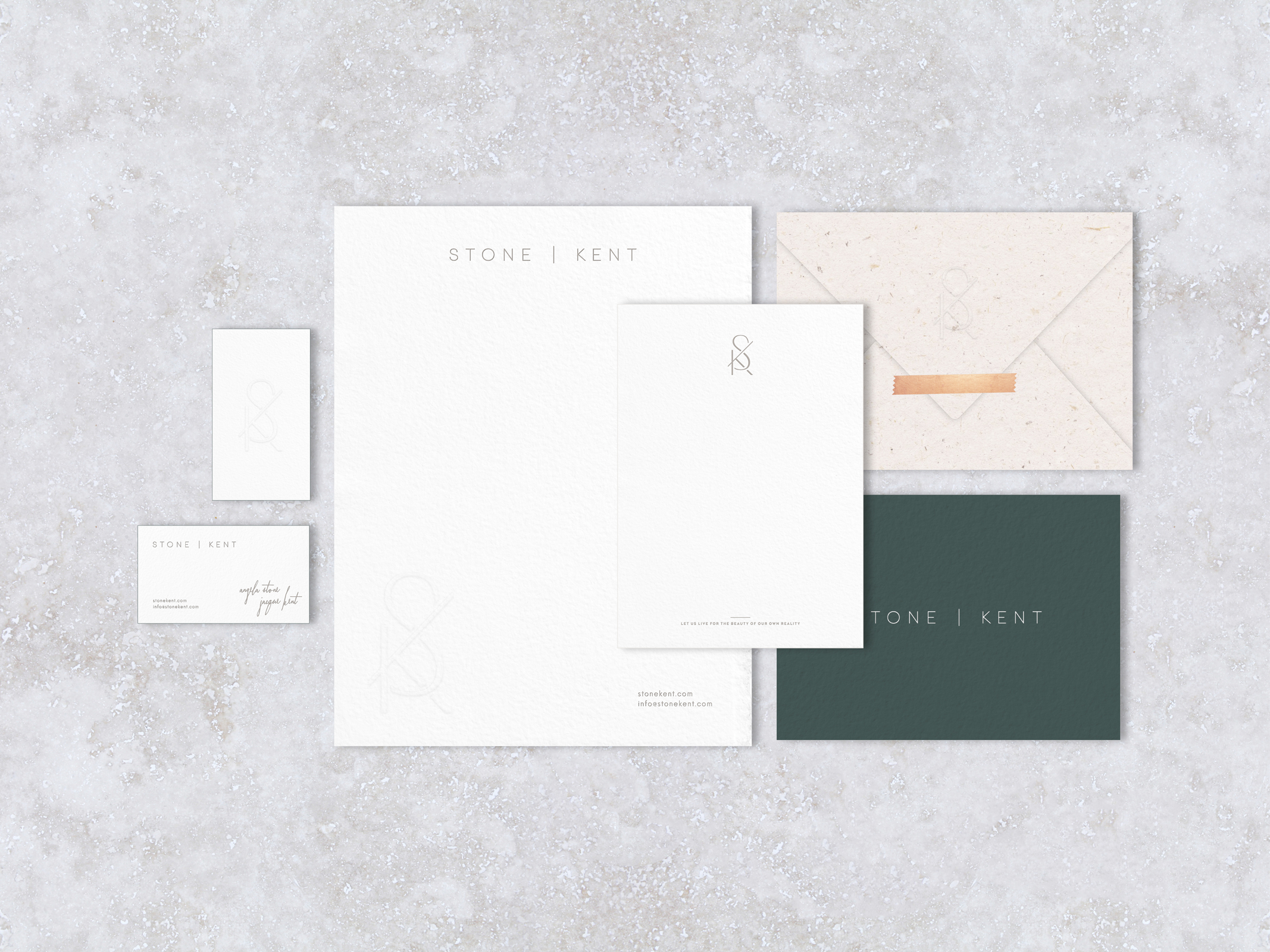
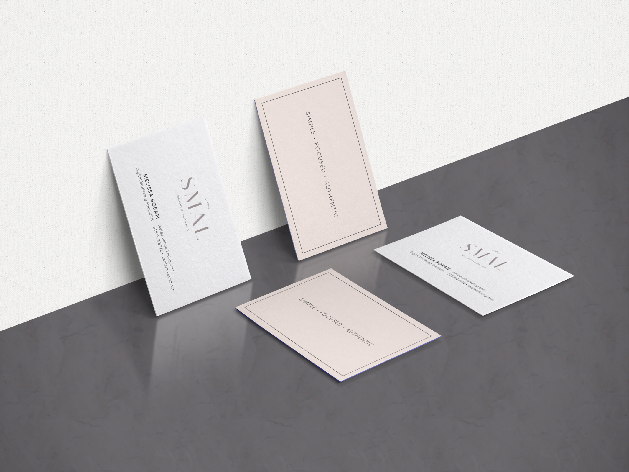
We achieved this look by using lots of soft whites, both warm + cool neutrals, as well as shades of clay, copper and dark olive green to add dimension and visual interest. We also used 100% natural cotton papers to add luxurious texture, and the perfect combination of blind embossing and letterpress printing to make the brand materials dramatic, yet subtle.
Stone | Kent Logo Design and Branding by Hello Gypsy
Stone | Kent Logo Design and Branding by Hello Gypsy
Stone | Kent Logo Design and Branding by Hello Gypsy
To keep the design refined and elegant, the brand style is focused on clean and simple layouts, delicate typography, plus interesting + natural backgrounds. Attention to detail is also very more important since the ideal client and target market for Stone | Kent is a high-middle to upper-class couple looking to infuse their home with luxurious design that fits both their lifestyle and personality. These ideal clients tend to be lovers of history, nature, and travel — especially drawn to natural textures, high end finishes, and subtle, yet beautiful design.
Stone | Kent Logo Design and Branding by Hello Gypsy
Stone | Kent Logo Design and Branding by Hello Gypsy
To see the full website, please visit stonekent.com.
And follow the Stone | Kent journey on instagram.
View More Work


